KNORR
Making a
global food
brand more
relevant
A defining Brand Transformation
Food trends reflect how people live, work and make choices. Health, sustainability, convenience, transparency and new eating habits are changing what consumers expect from food brands – and how quickly those brands need to respond.
For Knorr, one of the world’s largest food brands, this meant taking a more progressive, diverse and future-facing position.
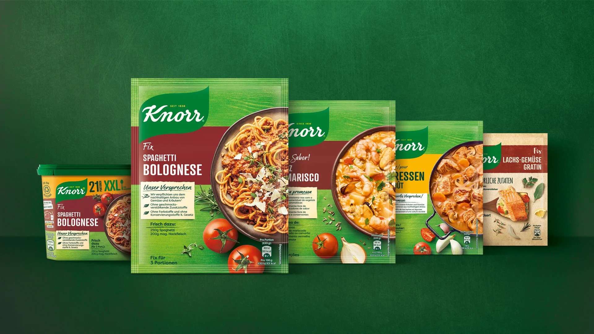
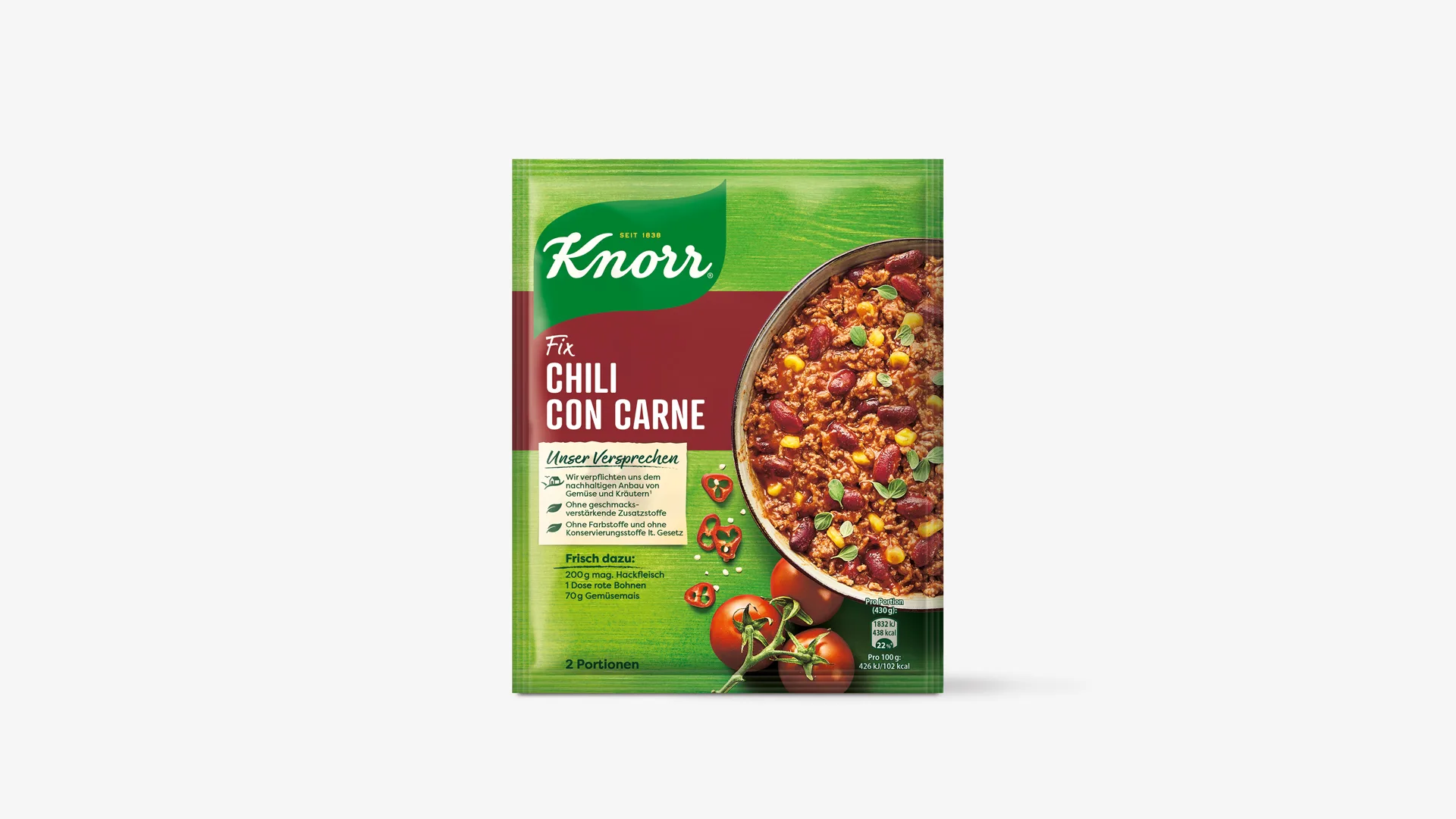
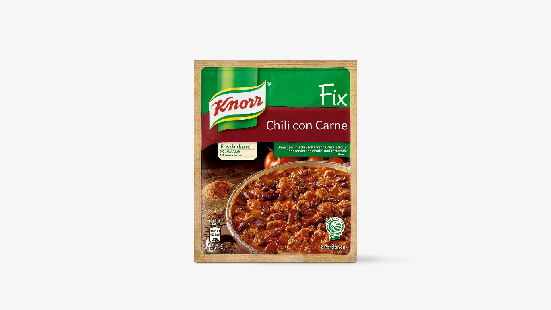
As part of one of the most important relaunches in the brand’s long history, Knorr created the foundation for a new visual identity: one that would make the brand feel more natural, transparent and authentic, while protecting the familiarity and recognition that made Knorr a trusted name across markets.
To bring this transformation to life across Europe, Knorr commissioned HAJOK, part of Spring CC since 2026, to adapt the new brand identity for European packaging and support the rollout across categories, countries and formats.
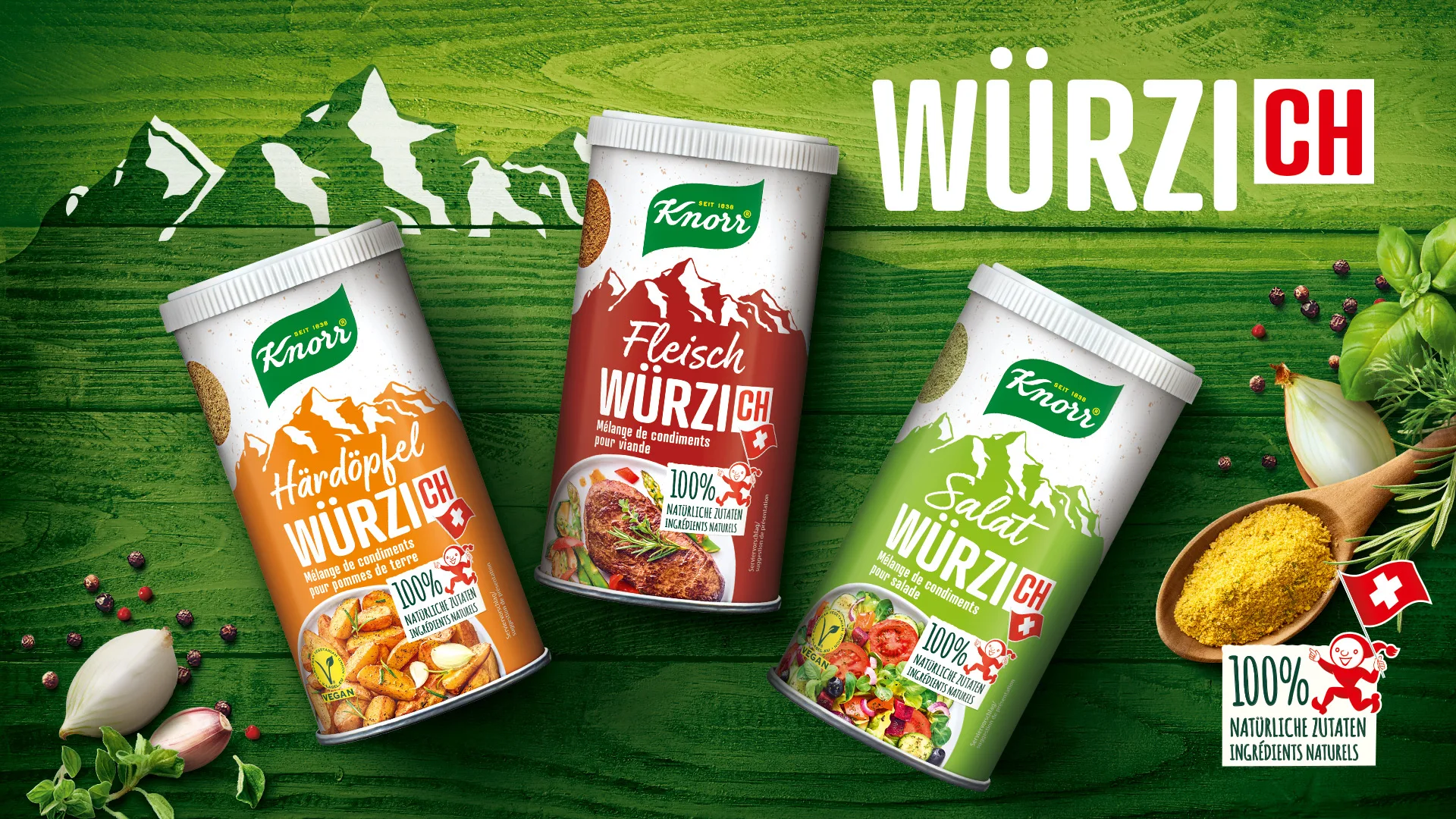
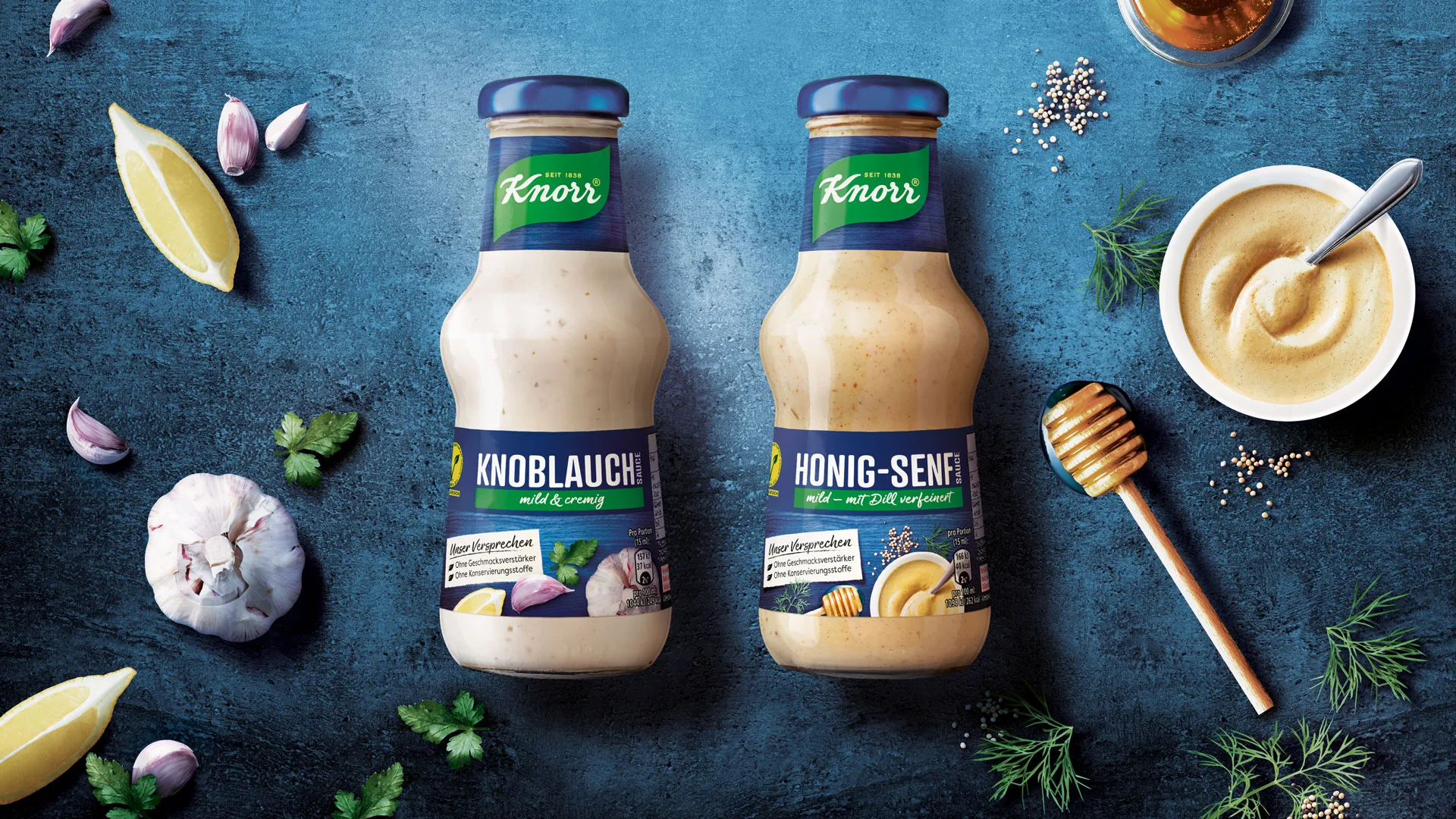
Great challenge
For the European market, our team supported Knorr with the adaptation of strategic food master designs and the full packaging rollout.
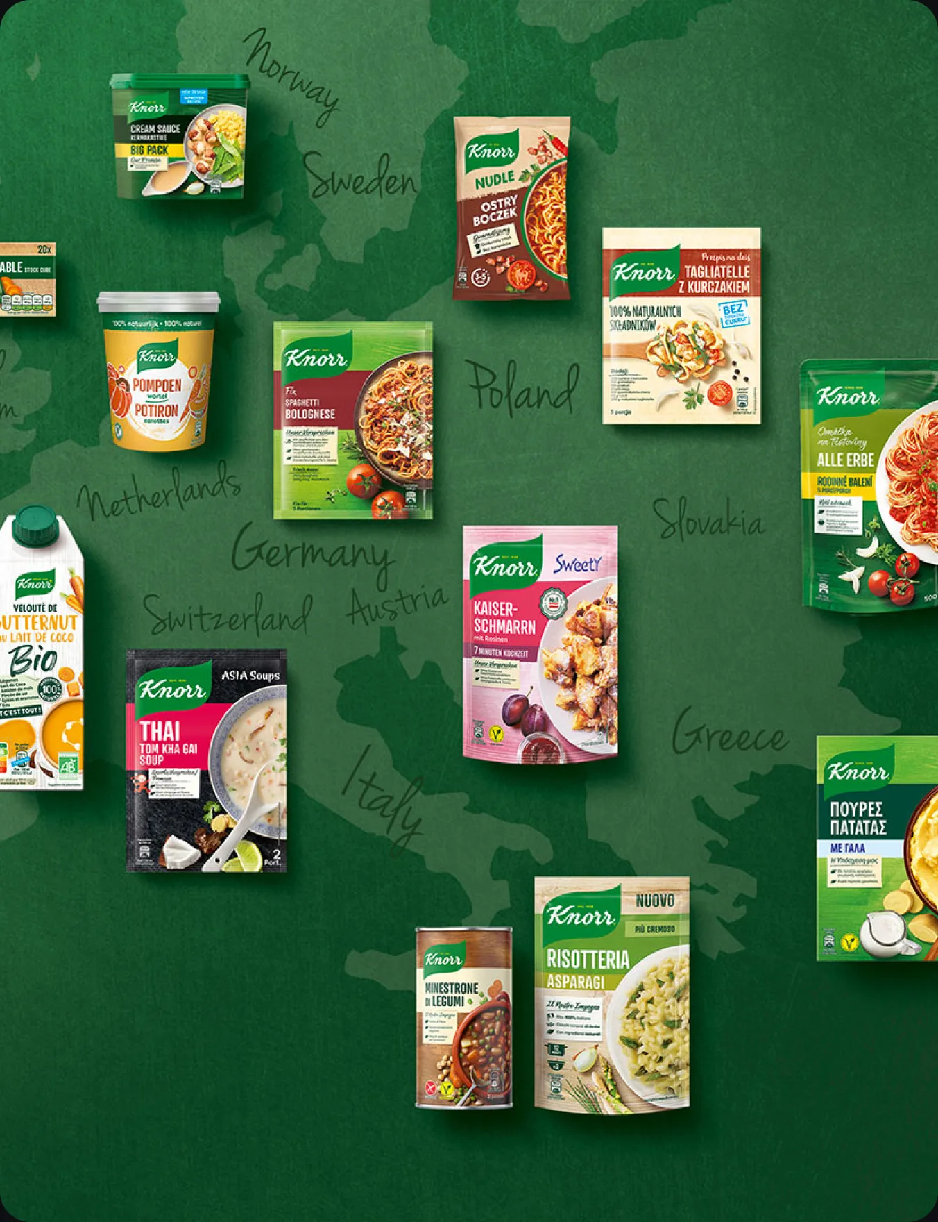
With more than 1,800 SKUs, multiple technical specifications, complex country-specific requirements and a wide range of packaging formats, this was a packaging project at significant scale.
The challenge was not simply to update individual packs. It was to translate a renewed brand identity into a practical design system that could work across a large and complex European portfolio.
The team brought previous Knorr relaunch experience into the process and combined strategic design understanding with practical rollout knowledge. That combination was essential to manage the scale, keep the work moving and protect consistency across every part of the project.
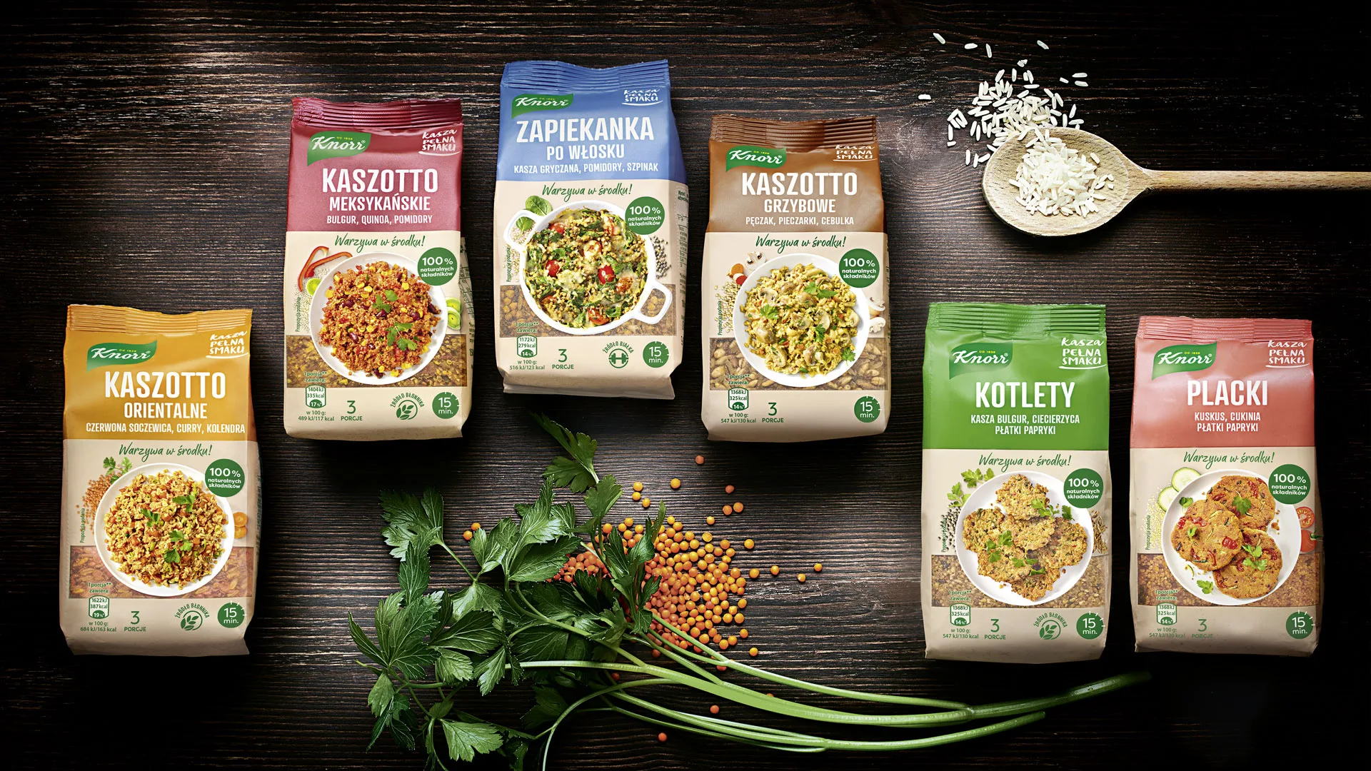
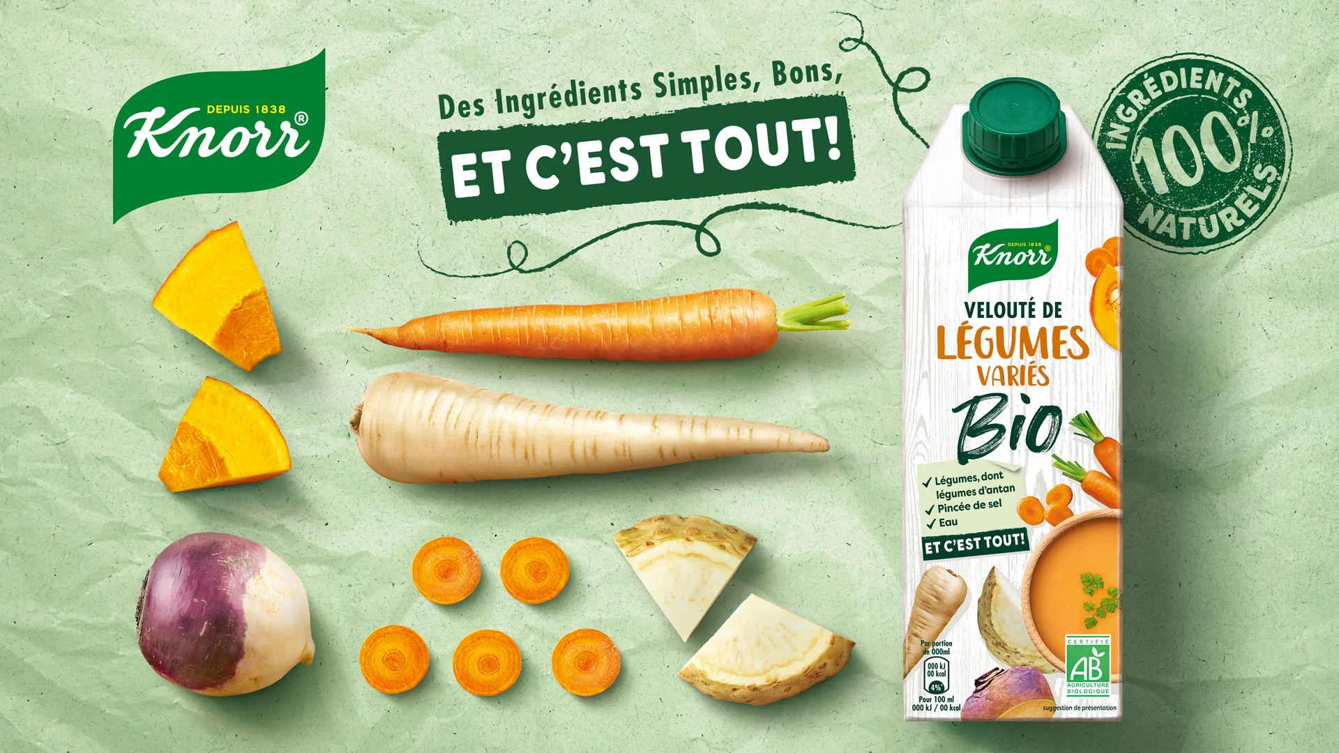
One language
The task was to bring different categories and regional market needs together under one global Knorr master brand.
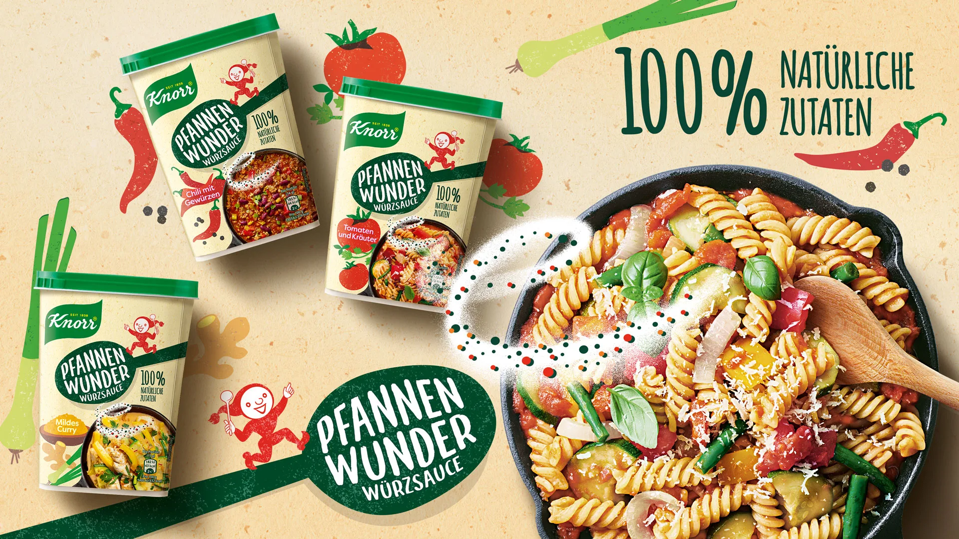
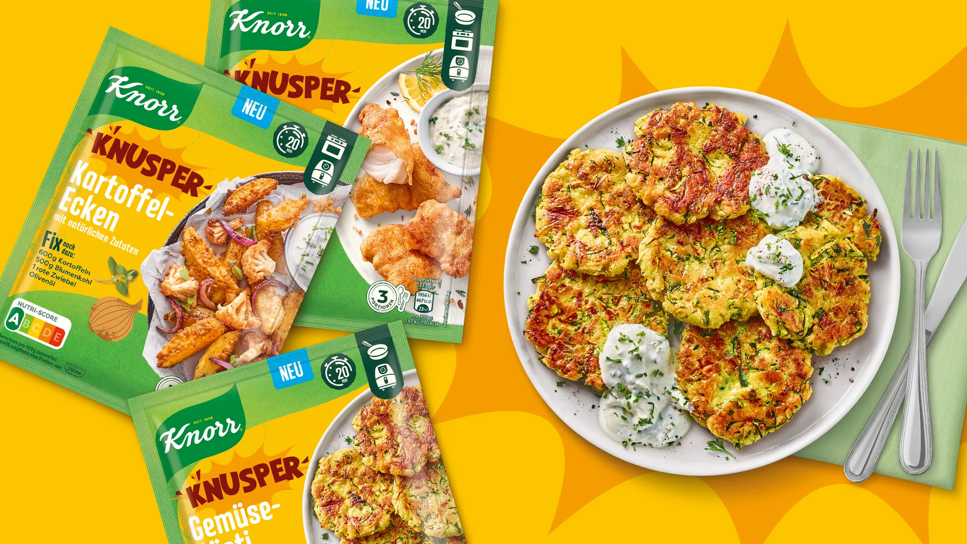
Across such a broad product range, some design differences were necessary. Categories needed their own logic. Local markets had their own requirements. Formats and product types created different practical needs.
But the brand still had to feel instantly recognisable everywhere.
The design system had to make Knorr easier to identify, while also making the food feel natural, appetising and relevant to modern consumers. The work created a more unified visual language across categories and countries – flexible enough for local and category differences, but consistent enough to strengthen the master brand.
On site
A project of this scale requires more than design. It requires the right setup around the work.
To support the process, we established a dedicated project structure with direct client contact, close coordination and clear ownership across the rollout.
A consultant worked on-site in Rotterdam as a direct contact for the Knorr marketing team, helping keep communication close and decisions moving.
In Hamburg, an experienced managing designer coordinated the design process and helped maintain a consistent brand expression across the European rollout.
Print expertise was also built into the workflow, ensuring that the packaging design could meet the technical requirements of different production methods and packaging formats.
The setup connected client, design, artwork and production knowledge in one coordinated process.
Total overview
To keep the work consistent across markets, categories and SKUs, we developed clear guidelines, checklists and design management processes.
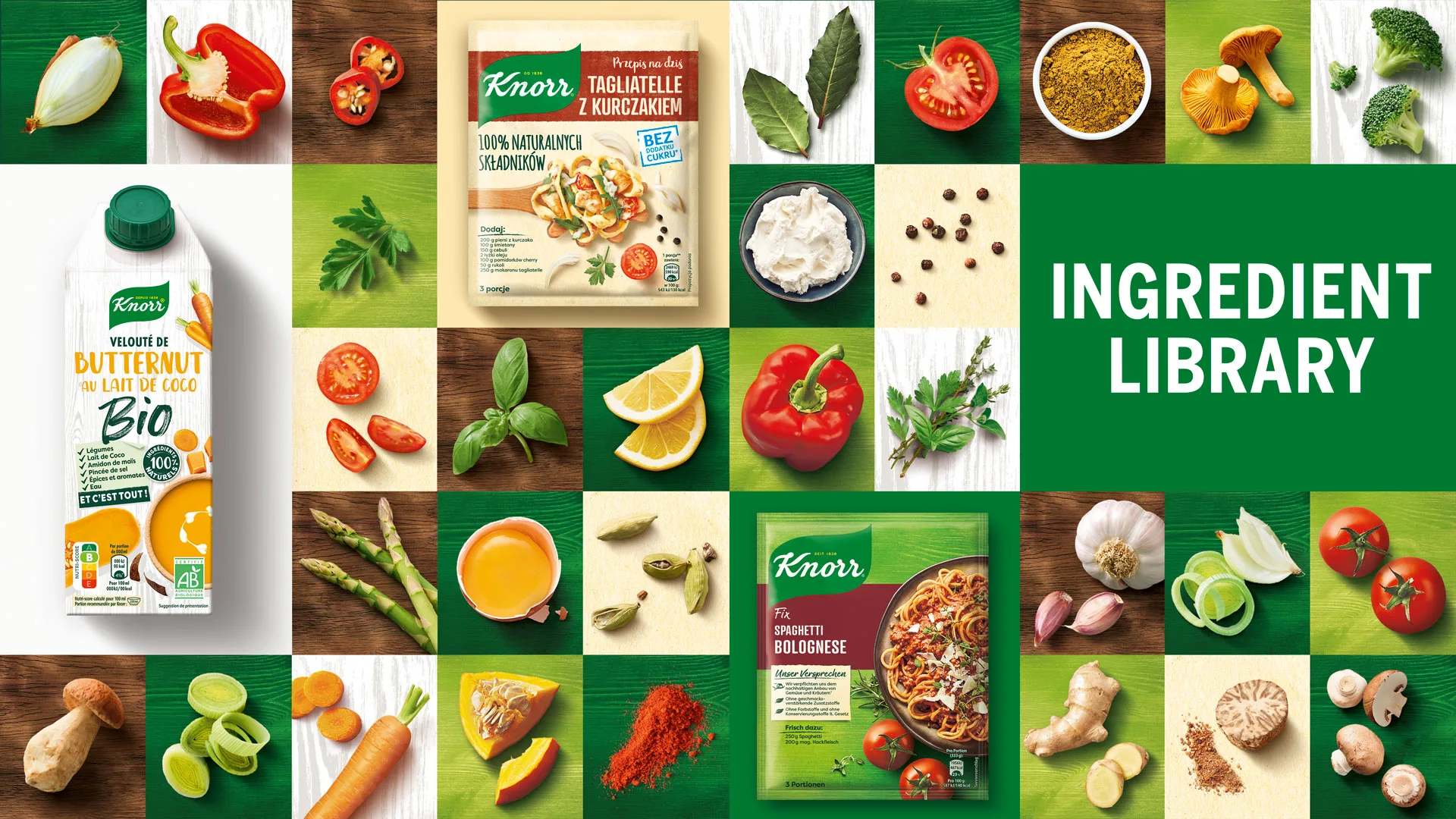
This helped protect the new identity as it moved into many different packaging versions. It also created a shared structure for handling details across markets, including fresh photography, both at a local studio or in-house, image selection, layout, pack information and print requirements.
The visual language was especially important. Existing and new food images had to support the more modern, natural and market-relevant expression of the new designs. Where existing images could work within the updated context, they were used to save time and cost without compromising the brand.
The project showed how complex packaging work can be managed when strategy, design, image handling, artwork, print knowledge and quality control are connected in one coordinated process.
From master design, master design adaptation to rollout, the work helped Knorr create a more consistent and recognisable packaging system across a broad European market – delivered by HAJOK as part of Spring’s wider agency group.